Product
Printed Guide
Roles
Editor
Designer
Tools
Google Docs
InDesign
The Burgundy France Regional Guide is a wine-tasting companion designed to enrich the experience of exploring Burgundy’s world-renowned vineyards. It provides curated insights into the region’s varietals, tasting notes, and wine culture, making it an ideal resource for both novice and seasoned enthusiasts.
Approach
Crafting the Burgundy France Regional Guide was an immersive, rewarding challenge. The project involved weaving together layers of information to create a resource as informative as it was engaging. This developmental edit required a clear vision, a firm grasp of the audience’s needs, and a commitment to presenting content that reflected both the richness of Burgundy’s culture and the practicality of an informational guide. My role was to ensure every detail—from sourcing credible content to optimizing layout and language—aligned seamlessly with the project’s goals.
Step 1 | Sourcing Content
Content sourcing began with a deep dive into the region of Burgundy, France. The goal was to gather a comprehensive range of information—local insights, historical context, culinary highlights, and geological knowledge—from trustworthy sources. Research spanned interviews with local sommeliers, as well as vetting online resources and pre-existing guides.
At this stage, I prioritized content variety to balance foundational knowledge with unique, lesser-known tidbits. The challenge was curating enough material to satisfy a reader eager for details, while avoiding overwhelming them. By organizing the gathered data into clear categories early on, I established a robust foundation for the subsequent steps.
Step 2 | Content Organization
Transforming raw material into a structured draft required meticulous planning. The goal was to create a layout intuitive to readers as they experienced each wine while providing a mental picture of Burgundy. I approached this with the perspective of a first-time visitor to the region with a special interest in wine tasting, asking questions like: What would be most helpful? What details would speak to the immediate experience of taste?
Content was organized into higher levels, addressing first the grape varietals grown in the area, and the the five sub-regions that are governed by the “AOC.” Within each section, I ensured logical progression—grouping together similar ideas and avoiding redundancies. The process included keeping the discussion similar across sub-regions by using the same headings.
Step 3 | Copy Edit for Style and Tone
With a solid draft in hand, I shifted focus to the language. Burgundy deserved a narrative as sophisticated and inviting as the region itself. During this stage, I ensured that the tone remained approachable yet polished, striking a balance between professionalism and warmth. Every sentence underwent careful revision for clarity and consistency.
Stylistic considerations included maintaining an active voice, varying sentence lengths for rhythm, and enhancing sensory descriptions to capture the essence of Burgundy. Editing also involved streamlining paragraphs for readability and intentionally introducing industry terminology through definition and additional discussion. Additionally, I reviewed transitions to ensure the narrative flowed seamlessly between sections.
Step 4 | Layout and Formatting
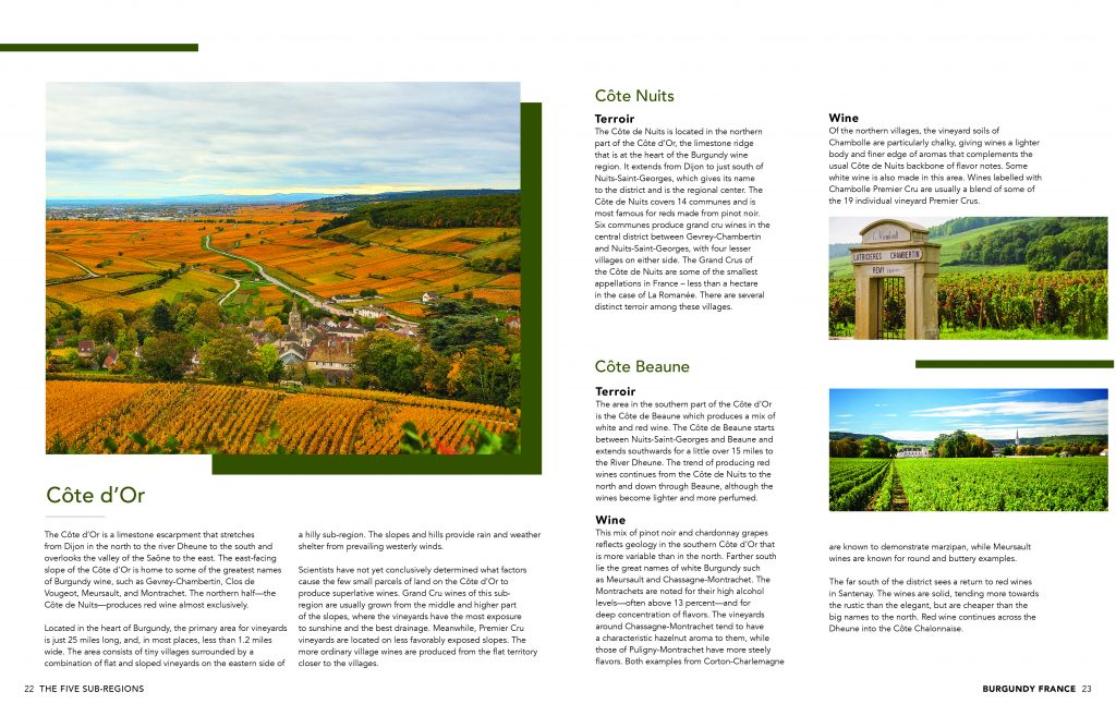
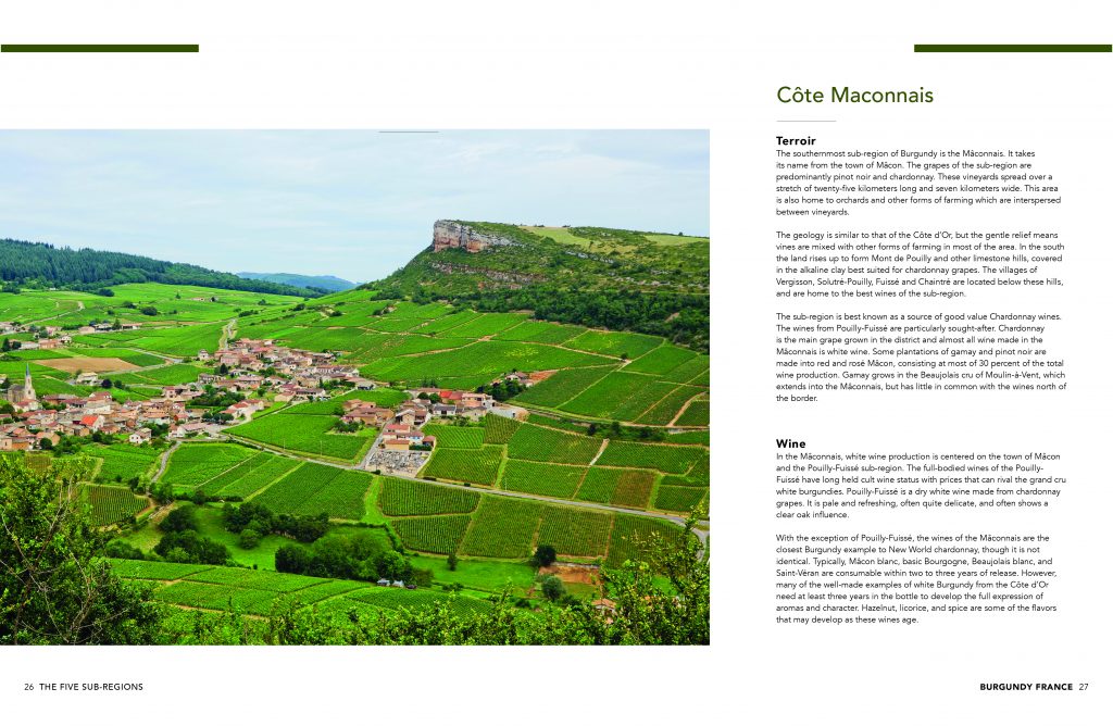
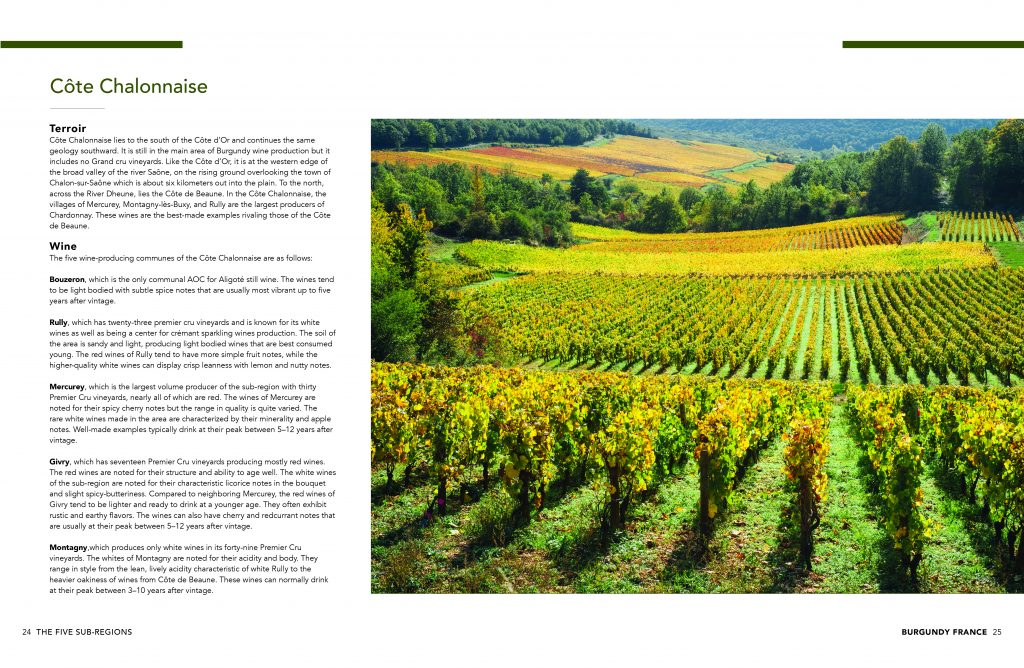
A great guide needs to look as good as it reads. Layout and formatting were integral to the project’s success. My goal was to create a visually appealing design that complemented the content’s flow and allowed the reader to absorb information effortlessly.
Key features included headers for quick navigation, bullet points for concise tips, and bold highlights for key terms. Charts, maps, and sidebars added visual interest and broke up dense sections of text. Attention to spacing and alignment ensured a clean, professional presentation.
As the graphic designer for the project, I selected color schemes, typography, and design elements that allowed for minimal distraction and easy reading. From initial sketches to the final print layout, every design decision was made with the reader’s experience in mind. The end result was a guide as visually inviting as its subject matter.
This stage also involved multiple iterations to ensure that the visual elements supported the content without overwhelming it. Collaborative feedback loops with the project owner ensured alignment between the design and editorial goals, creating a cohesive and user-friendly final product.
Step 5 | Final Project
The finished Burgundy France Regional Guide was a collaborative success, blending detailed research, thoughtful editing, and strategic design. More than just a travel resource, it became a tool for discovery, inspiring readers to explore Burgundy’s depth and diversity. From its carefully curated content to its elegant layout, the guide exemplified how thoughtful development can elevate an informational resource into a memorable experience.
Through this project, I not only honed technical skills in developmental editing but also deepened my appreciation for the art of storytelling in non-fiction. It reinforced my belief that good editing is about more than fixing grammar or punctuation; it’s about creating a seamless connection between the writer’s intent and the reader’s needs.


